言霊 - Kotodama
App/Responsive Web
Project Overview
My roles: UI/UX Designer, UX Researcher, Copy writer, Coder.
- Gamify learning
- Simple quizzes
- Japanese culture theme
- Accessible on both mobile app and website
I have quite the patchy experience with learning Japanese and found that most of the usual language memory apps did not motivate me enough to keep up the practice. Therefore, I wanted to design an app that would keep me coming back not just for the learning but for the fun.
Design Choices
Gamify
I wanted to gamify the experience of learning a language. A lot of the ordinary language learning apps are not engaging enough for me and I keep forgetting to sit down with the quizzes. However, if there was a story, some characters, and a clear goal, maybe some clear rewards as well, it would create other reasons to get back into it beside learning the language.
Keep it simple
It's easy to get a little bit too excited when designing a game. To keep the level of complexity down I stuck to designing something I could implement myself as a responsive website. Therefore, I tried to keep everything to static images or a few animated characters and not create a whole game world. I could scale it up to a smaller Adventure type of game, but that would raise the bar significantly.
Research
Competitive Analysis
To get an idea of how to design a language memory app and also to gamify the experience, I looked to similar apps for ideas. I choose Memrise and Duolingo as indirect competitors. As they are two well known language apps there could be a lot to learn from how they do things. For direct competitors I choose two mobile apps, they both try to gamify the Japanese language learning experience and contrasting the two against the more classical learning apps will showcase where the learning/teaching differentiate.
Memrise
SUBSCRIPTION
- Language quizzes with sound and choice answers.
- Points awarded for doing courses to level up
- Can connect with friends
- No achievements, as far as I can tell
- Good accessibility; hierarchy, voice-over, contrast
- Simple, modern design
Duolingo
PLUS PLAN
- Quizzes with images and sound. Choice answers or piecing together a sentence
- XP points for doing courses
- Can connect with friends
- Achievements
- Good accessibility; audio, hierarchy, contrast
- Overall design is game themed
kawaiiDungeon
FREE
- Battles where attacks are correct answers and damage taken is wrong answers
- “Loot” awarded for doing a level, and stars for completing certain course specific missions
- Can upgrade character with new items
- Community hub and a leaderboard
- Achievements
- Accessibility needs work; no voice-over or voice control. All right contrast.
- Typical Japanese styled characters and overall design
Japanese Dungeon
FREE
- Battles where attacks are correct answers and damage taken is wrong answers
- Coins awarded for doing a level
- Can upgrade character with new items
- No social feature
- Achievements
- Accessibility needs work; no voice-over or voice control. Good contrast.
- Pixel styled western rpg design
Across the spectrum there was a lot of similarities and a few shortcomings, especially of the gamified variants. Accessibility was one thing that fell short as it was almost impossible to interact with the gamified apps in any other way than with 80% vision and taps. While Memrise and Duolingo didn't have all the upgraded characters, story elements, or level missions, they did have better social features. In the end, considering my restrictions and limitations I decided on trying to improve two things with my design in regard to my direct competitors.
Accessibility
Accessibility is important. My design would have to have clear hierarchy for screen readers and make sure the contrast is good enough for bad eyesight. When it comes to code, the hierarchy from the design need to be present in the structure of the code and accessibility tags implemented to make it easier for screen readers and voice control to navigate the application.
Play with friends
Sometimes learning together can be the right motivator and since my direct competitors lacked any distinct way to connect with friends, it would be good to have it in my design. However, I might not be able to implement such a feature myself. I will include it in the design as a future feature that doesn't need to exist within the final design for it to look and feel complete.
Problems & Solutions
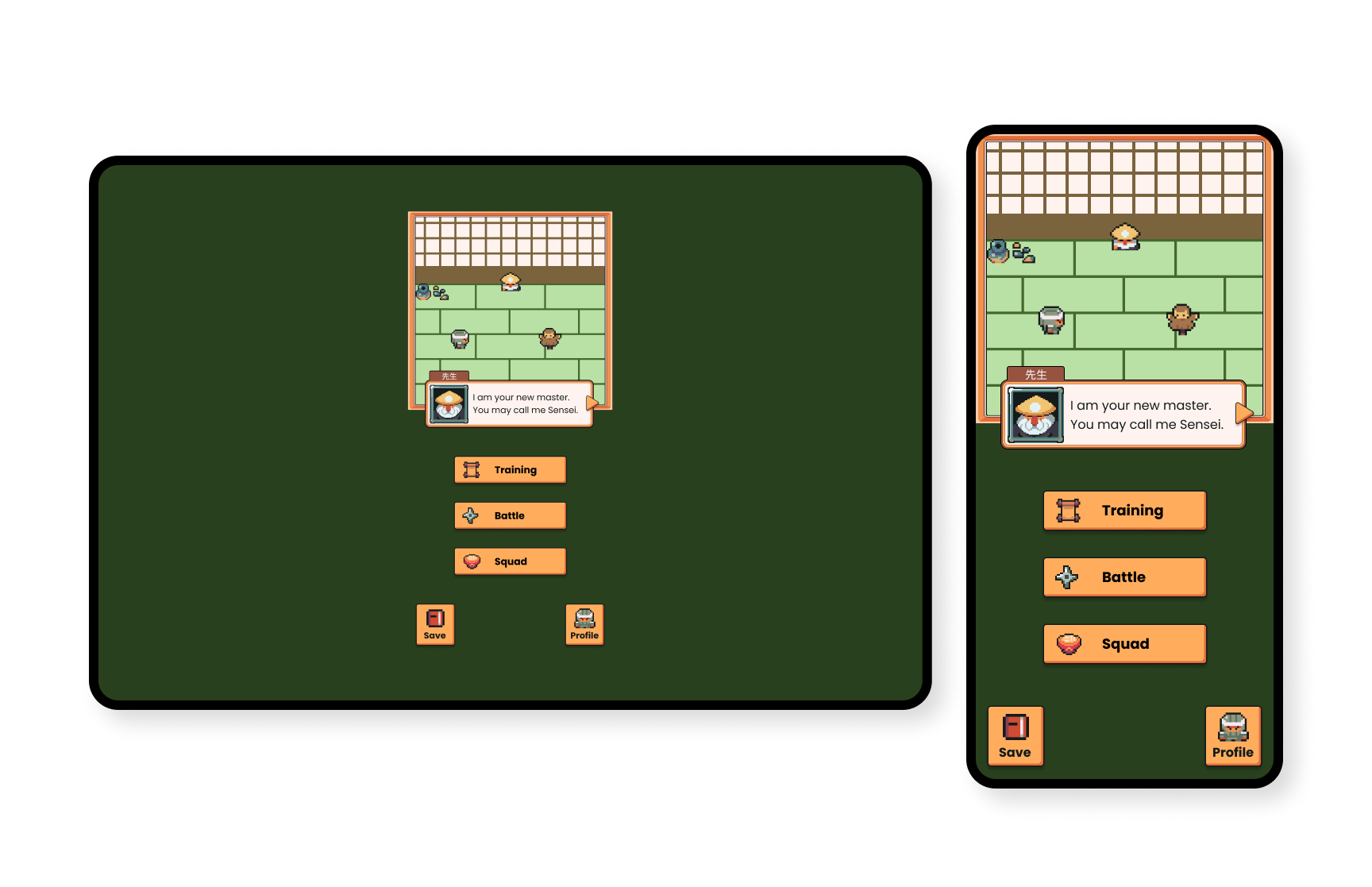
Quite early I realised I would need some sort of resources and graphical assets to create this game. I could make them myself but it would take time away from designing the app itself. I managed to find the Ninja Adventure assets created by Pixel-boy on itch.io under the CC0 1.0 license. This proved to be a great pack since it fell in-line with my choice to make it a have some sort of Japanese cultural theme, because of the resources I found I decided to make it Ninja themed.
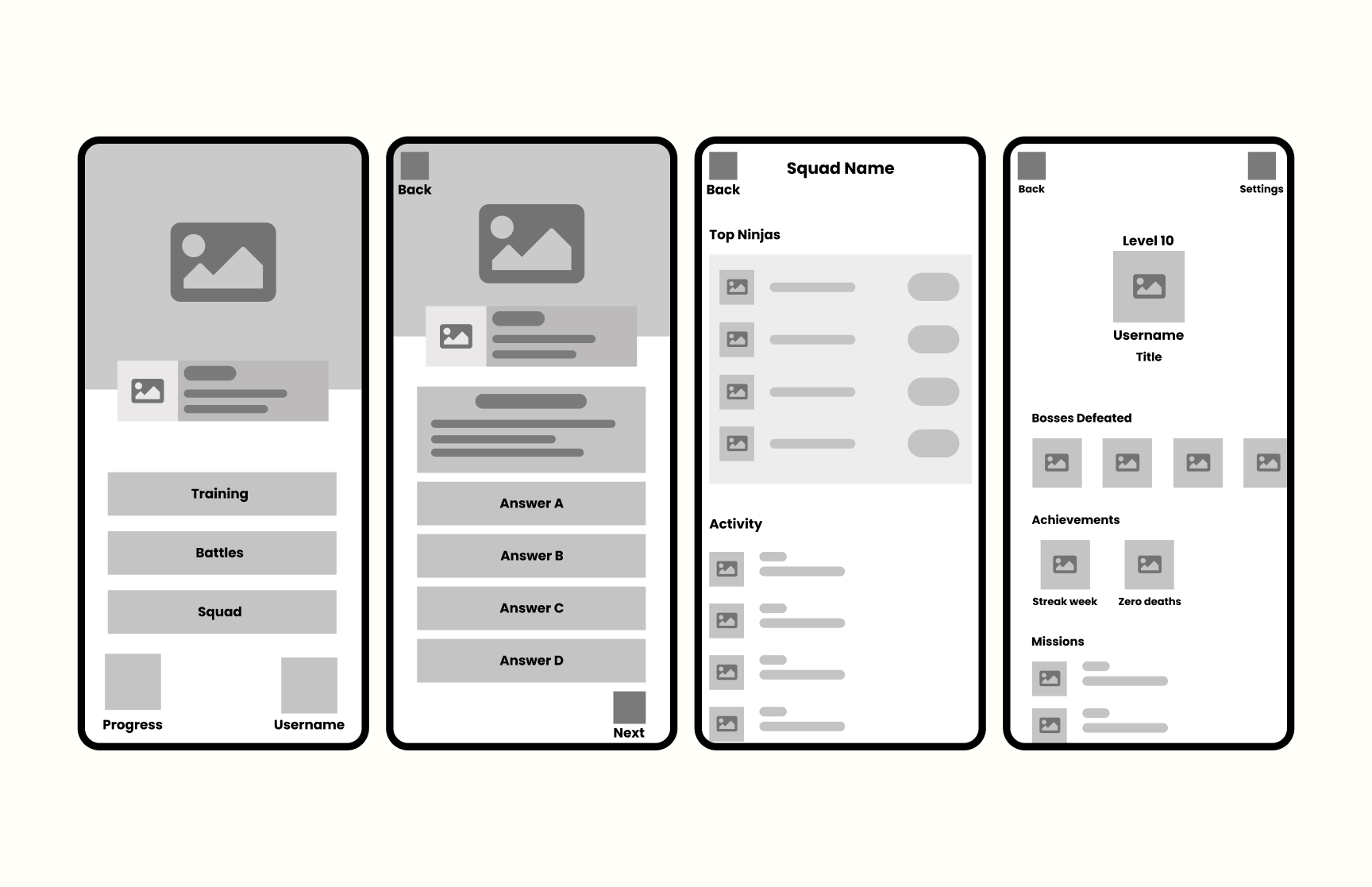
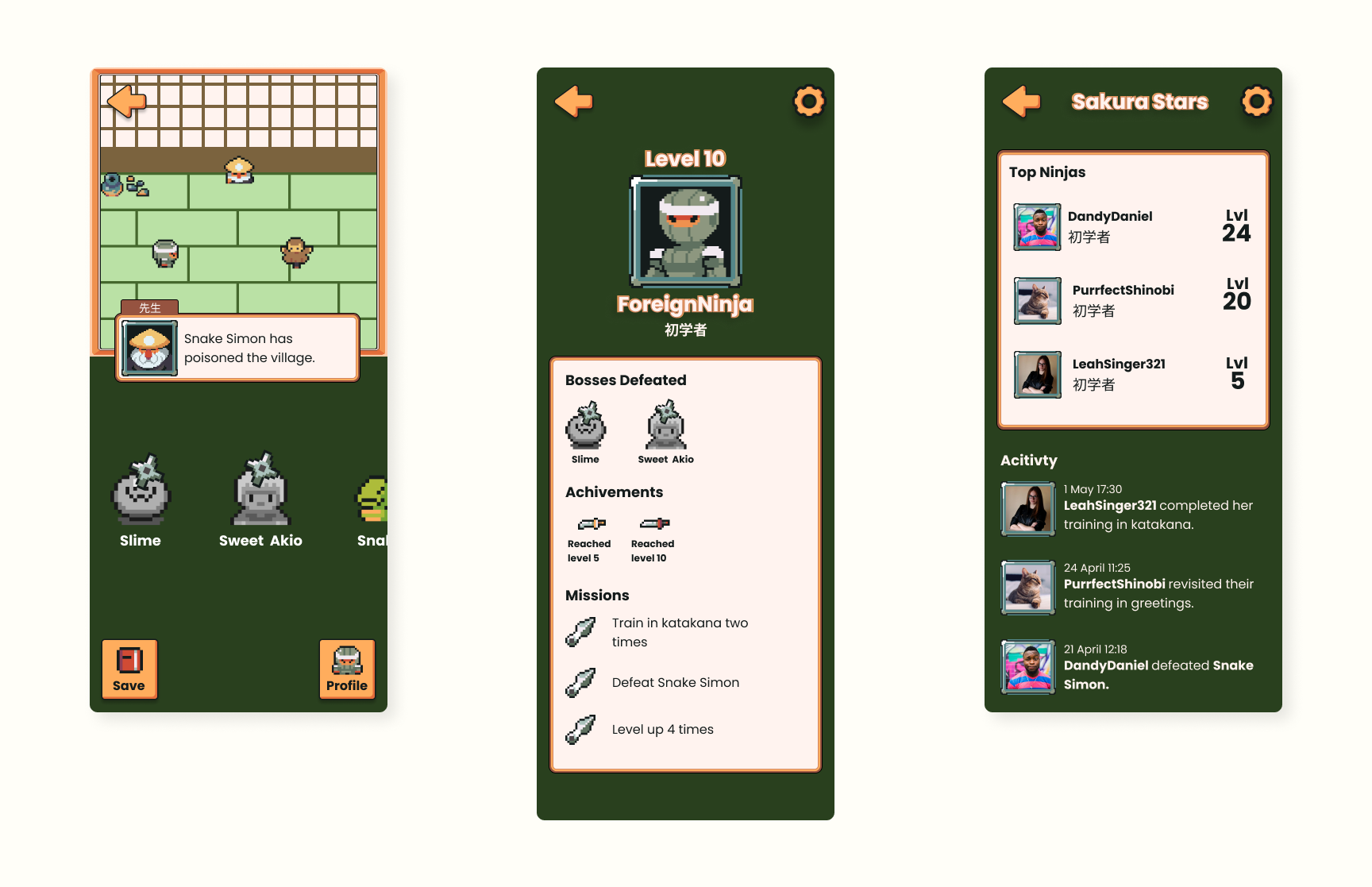
Achievements, treasure, level specific missions, and character progression were all features of the two gamified language learning apps I studied in my research. I decided to showcase all of this on the user profile. Consolidating it all on one screen and using each element as a "trophy", essentially making the profile screen a trophy showcase, kept the features simple without the use of much extra resources.
Saving progress and user information on the web usually requires servers of some kind. However, I decided to include a "progress" feature where users can save or restart their progress by saving it in local storage in the browser. This way the user has control of their information and I will not have to keep a server.
Final Design
For the final design I used a mix of the resources I found and some that I made myself. The overall design was made consistent and kept to the feeling of a Ninja themed game.
I focused on accessibility by making sure the contrast of key elements were at least AA. I made sure the tap targets were large enough to click. I also included an option in profile settings for users to choose their pronouns.
After testing the final design on a few users, they responded that it looked fun and engaging. They also highlighted some final issues I corrected such as fading the background when dialogue ran in the dialogue box.
What I learnt
This project taught me how limitations and restrictions can shape the design quite drastically. I had to put aside certain ideas or narrow them down to make sure I didn't over scope. In a way, it was fun to see how one thing can be done differently depending on available resources or limited execution.
It was my first time designing something game-like and I had fun trying to set the atmosphere of a master training their pupil in words of power to defeat different bosses. I hope at least that I managed to create a user experience that leaned in that direction.
Any Questions?
Let's talk about it.


