Teenagers' Healthy Habits
App/Responsive Web
Project Overview
My roles: UI/UX Designer, UX Researcher, Copy writer.
- Designed for social good
- For teenagers
- Educational
- Lifestyles
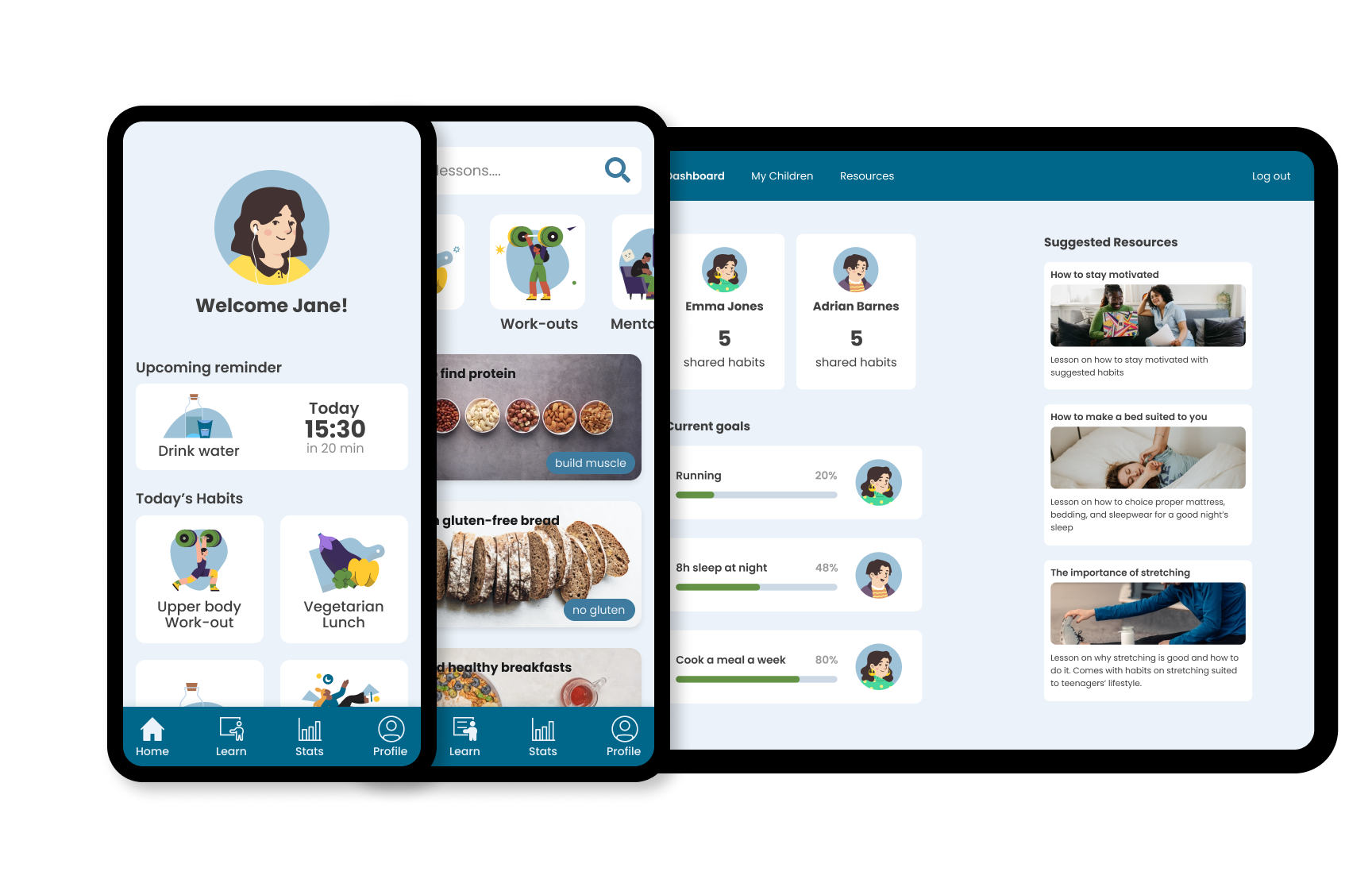
For my final project of the Google UX design course on Coursera, I decided to do a health app for teenagers. There are a lot of health apps but few focused on teenagers. Even less so health apps for teenagers that also involve their parents. Therefore, I wanted to make a web based parent portal so that parents can set goals for their teens and work together for a healthier way of living.
Design Choices
Lifestyles
I wanted to include the ability to customize the health app to the user's own health limitations and needs. Such as chronic pain, diet restrictions, or desire to focus on specific life improvements. Health is personal, including this "lifestyles" feature will allow the app to suggest lessons and habits based on those lifestyles and keep irrelevant content, which could discourage the user, out of sight.
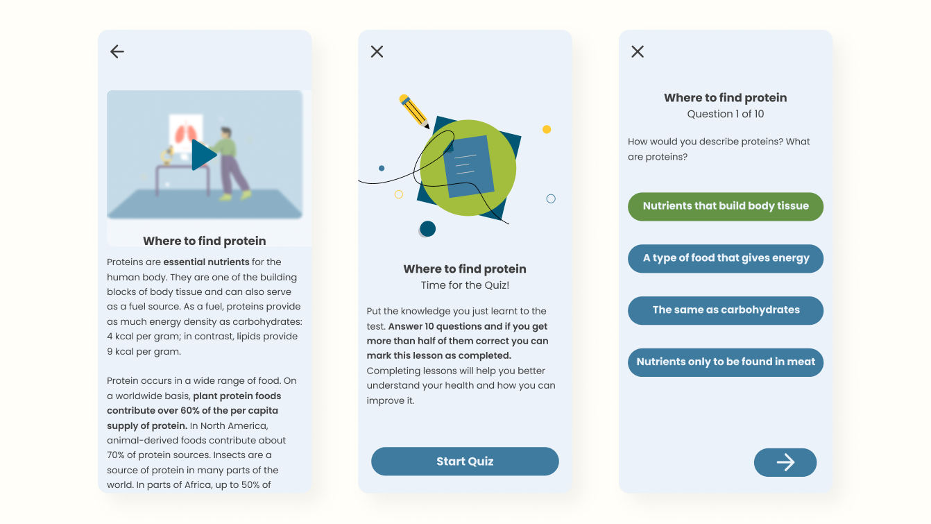
Lessons & Quizzes
To truly control your own health you need to know what you can do about it. For that reason, I wanted to include lessons and quizzes so that the user could learn more about health. The lessons would be based on their lifestyle and hopefully motivate the user to add habits after completing them.
Research
Competitive Analysis
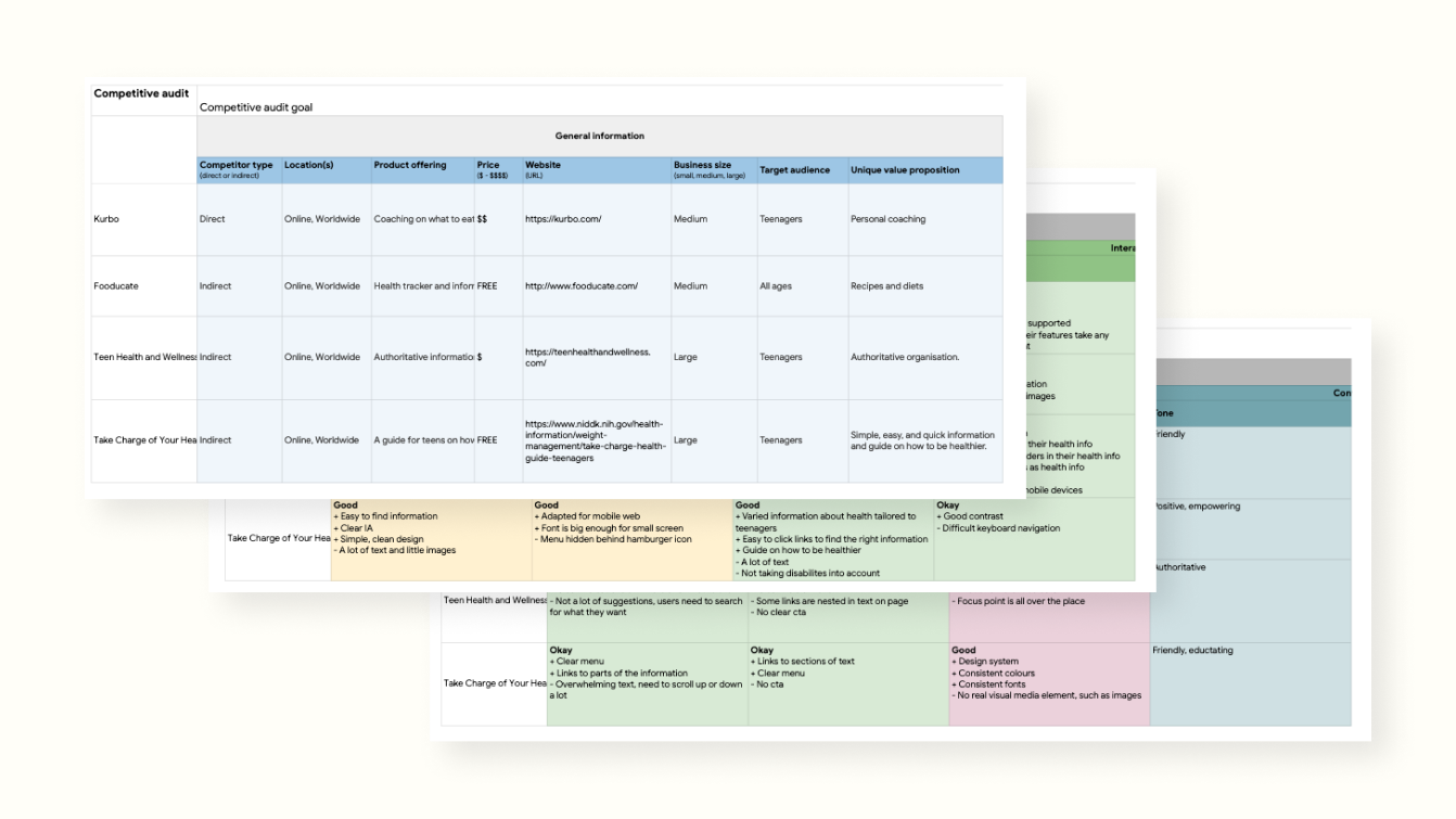
I did competitive research on similar websites and applications. I found only one direct competitor, as most health apps were aimed at everyone, or adults. However, I did find 3 indirect competitors; one that focused on habits and diets, and two others that were text-heavy educational health information for teenagers. The main take away from the competitive analysis was the lack of specific health apps for teenagers. Unlike the very text heavy websites with information about teenagers health, an app might better reach the demographic. While the direct competitor filled those shoes quite well, they did so with personal coaching instead of allowing the teenager full control of how the app worked for them.
Competetive Analysis Findings
- There is a lack of easily digestable information on teenagers' health
- Most of the competitors did not have a modern, well-thought out design
- Most of the competitors offered only information and no other health feature
- Most of the competitors focused on fitness/diet and did not take other forms of health into account
- No competitor allowed teenagers complete agency over their health without the feeling of being “controlled” by adults.
- Only 1 competitor showed health in regards to chronic and mental illnesses
Usability Study
After the competitive analysis, I created lo-fi wireframes to test on users. I tested the app on teenagers and parents of teenagers.
Usability Study Findings
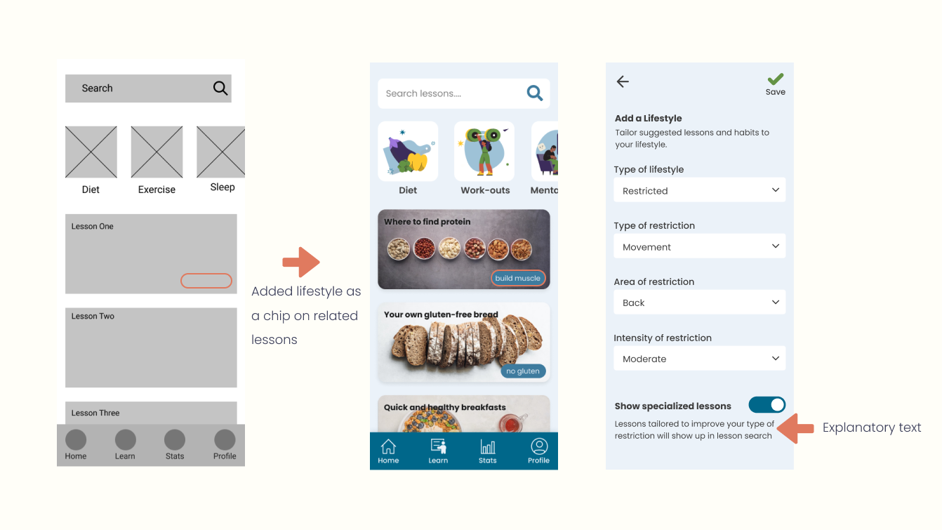
- Most users were confused about how lifestyles worked and what they were used for.
- Most users wanted onboarding before entering the home screen and before starting a quiz.
- Most users wanted a clearer overview of their habits on the home page.
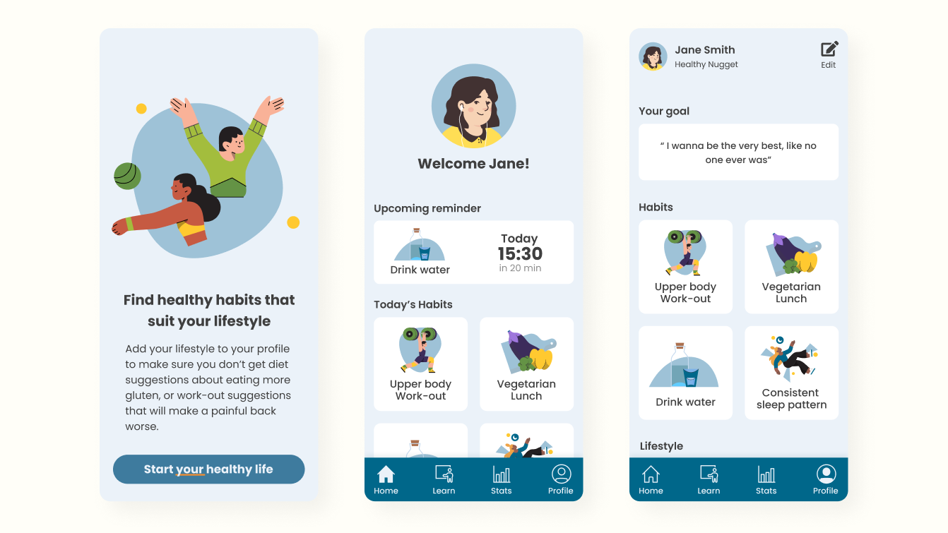
Based on the feedback from the usability study, I added a first-time user onboarding. I also made some changes to the design of certain elements to better showcase how lifestyles worked.
Problems & Solutions
I found quite early on that what should've been a simple habit tracking app, had become something more. The scope and features added on became a mountain of additions rather than a peaceful valley meadow. I had to sit down and sort out why I had the features I had and how they would interact. As an example, I removed something called "tasks" which would be smaller habits of one larger habit, sort of how you make smaller goals to reach a larger goal. This was tested on users and they expressed confusion when interacting with the feature. I decided against "tasks" and removed them entirely.
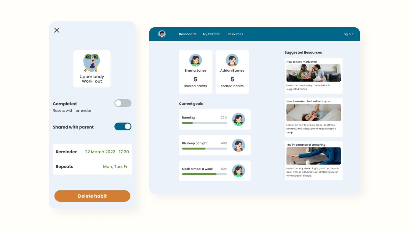
Parents of teenagers wanted a way to interact with them, to be part of their health journey, without forcing cooperation. There was no way of doing so within the app itself without taking away some feeling of control from the teenager. After all, the app should be a space where the teenager could control their own health without any adult pressure. Therefore, I utilized a web page to have a parent portal where the parent can create goals for the teenager, with the promise of a reward at the end, and request to track the teenager's habits. It was then up to the teenager to allow sharing of a habit with their approved parent in the app.
Final Design
For the aesthetic part of the design I wanted something that felt youthful, yet simplistic and modern. The most commonly used colours for health and exercise apps are blue, green, and orange; so I used them all. Blue as a primary, green as secondary, and finally orange as an accent (orange was only really used for a delete button, which in retrospect should be scaled down on the visibility scale). I settled for an overall flat style to make it feel as sleek as possible, yet fun and friendly.
To make sure the selected state of the tabs in the tab bar was accessible, I changed the icon for selected state.
I tested the final design on a few of the same users and they all enjoyed clicking through the app. One user expressed it was "educational and felt nice to navigate".
What I learnt
This project was part of the Google UX design course on Coursera, and as such I had great guidance on how to proceed with this project each step of the way. It taught me how to set up a project and complete it, including every possible moment of the process. I found out which parts I was better at and which parts I needed more time for. Because of this, in the future, I will know how to pace myself during each project phase to make sure I do not allocate unnecessary amounts of time on things I do quickly and vice versa.
Any Questions?
Let's talk about it.